

We Love Algebra by Commercial Type
We Love Algebra by @commercialtype Buy it now on: https://commercialtype.com
Info from the foundry:
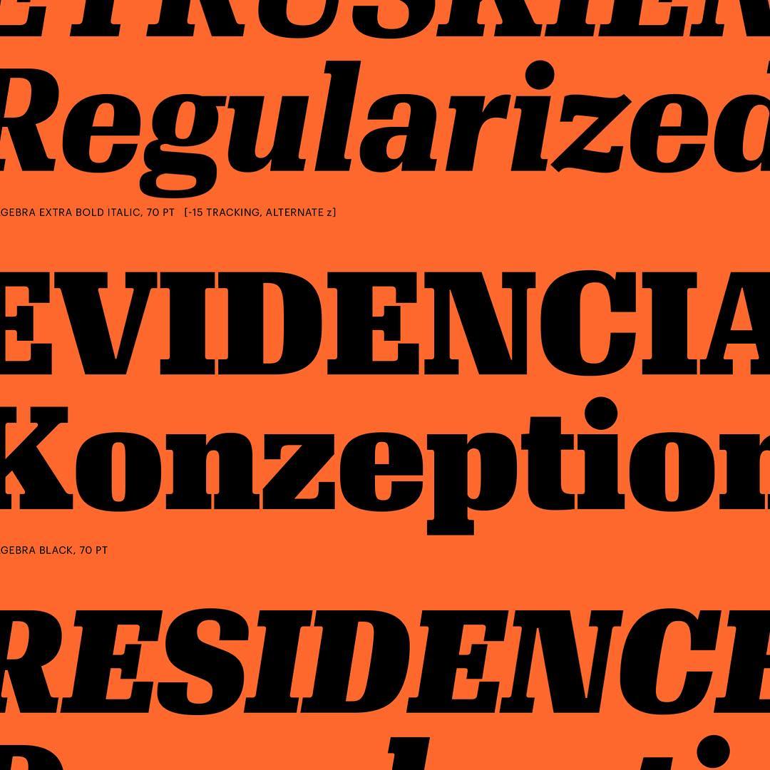
Algebra evolved from Granger, a headline
typeface designed by Susana Carvalho and Kai Bernau for the US edition of Esquire in 2010. This broad-shouldered slab serif typeface is built on superelliptical forms. Its loose spacing gives a remarkably comfortable texture in long passages of text, with its even rhythm working well on screen, on newsprint, and for magazine and book design.
Algebra references such squarish 20th century serif families
as Adrian Frutiger’s Egyptienne, Georg Trump’s Schadow, and Hermann Zapf’s Melior, but its clean lines make it appropriate
for contemporary use in modern magazine design. Though the at vertices where diagonals intersect (as in the A or M) are far less dramatic than in Algebra Display, these letters have a brutal feeling, playing nicely o of the bulky round shapes. Functionally, the at vertices keep the letters from clogging even under the worst printing conditions. Simple italics match the directness
of the romans, and a handful of alternates allow the italics to take on a softer, more traditionally cursive feeling. Five of the six weights can be used at any scale, for text or display, though we recommend negative tracking at larger sizes. The forceful Black weight is designed only for display use, and its tight spacing and tiny counterforms do not work at text sizes.
Published: 2016
esigned by: susana carvalho & kai bernau
Production assistance: hugo marucco
Algebra comes with: 12 styles / 6 weights w / italics
Features: proportional lining figures tabular lining figures
Fractions (prebuilt and arbitrary) superscript/subscript


